
3 Ways to Create an Achromatic Colour Scheme for Your Home
In a previous article titled Achromatic Colour Harmonies in Interior Design, we explained what an achromatic colour harmony is and how its versatility can result in vastly differing interiors that suit almost all design styles, as well as the tastes of men and women alike. We saw that achromatic colour harmonies can be used in almost every space in your home, from kitchens and bathrooms, to living rooms, hallways and bedrooms. In this article, we explain how to use the principles of colour theory to create an achromatic colour scheme for your home and show you 3 ways in which to do this.
Choosing an Interior Design Style for Your Colour Scheme
Before creating any achromatic colour scheme, you must decide on what style and mood you wish your space to convey. Are you seeking to create a warm, cosy, cocooning space? a soft, airy and uplifting space? or, a cool dramatic space that makes a statement? Also, what interior design styles are you drawn to? Do you like modern, contemporary, industrial, transitional, mid-century, eclectic or traditional interiors? These are all questions that need to be considered when creating colour schemes for your home, as they will impact its overall look and feel.
Applying the 60-30-10 Colour Rule to Your Interior Design Style
Once you have decided on a style and mood for your room, the next step is to select the dominant, secondary and accent colours for your achromatic colour scheme. At this point, you might be asking “but how do you determine how much of each colour to use?”
As a starting point, we recommend using the 60-30-10 colour rule to determine the percentage to be used for the dominant, secondary and accent colours in your achromatic design scheme. This classic rule is used by interior designers to create visually cohesive and balanced designs. Following this rule helps to avoid interiors looking imbalanced due to one colour being overly used and becoming overpowering, or, because not enough of a colour has been used and the overall look becomes flat and incomplete.
How to Create a Sophisticated Achromatic Open Plan Living Area
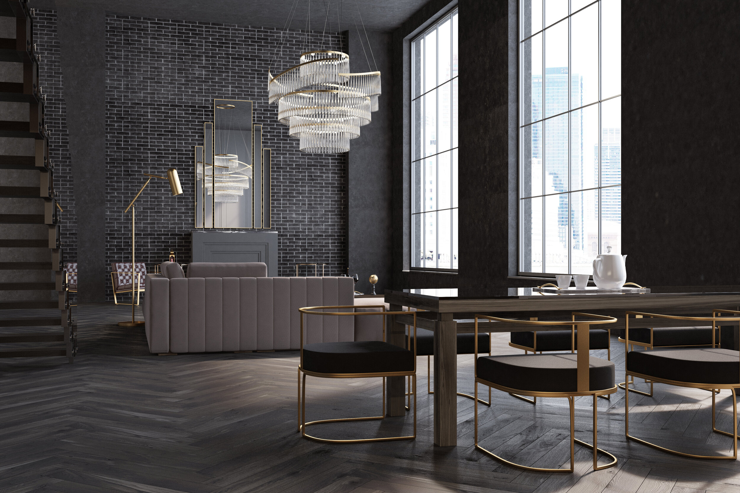
This open plan living area is dark, yet luxuriously sophisticated. The key to creating balance in this room so that it does not become overly dark and heavy, is to minimise the use of pure black hues and to ensure there is ample natural light flooding the room. The oversized, undressed windows certainly help to achieve this. To create a similar interior design look for your open plan living room, apply the 60-30-10 colour rule as follows:
60% Dominant Colour - charcoals, dark greys
30% Secondary Colour - warm greys
10% Accent Colour - gold metallics
Note: Although gold is noted as the main accent colour, there is a second accent colour, pure black, which has been used. By predominantly using softer blacks, such as charcoals, to which a small injection of pure black is added, subtle nuances of colour are created which add body and depth to the scheme.
INTERIOR DESIGN TIPS:
Pay attention to the repetition of pattern used in this interior design scheme. The rectangular lines of the architectural elements have been repeated throughout. This subtle yet succinct repetitive detailing will ensure that your design is fluid and in keeping with the architecture of your room.
Do not be afraid of leaving your windows undressed. When your room has such stunning features that serve as focal points, show them off! If you can’t bring yourself to do this, add motorised blinds that are completely concealed when not in use.
Do not be tempted to overstuff your room because it is large. Only incorporate furniture that has a function in the room, otherwise you will ruin the look.
Use warm white bulbs in your lighting to finish off the look!
WAYS TO CHANGE THE LOOK:
To soften this look without compromising its clean lines:
Add textured fabrics, such as fur throws and wool rugs to enhance the softness of the overall look
Introduce artwork that incorporates the colours of the design scheme, into key areas of the room. This will create interest as well as soften the space
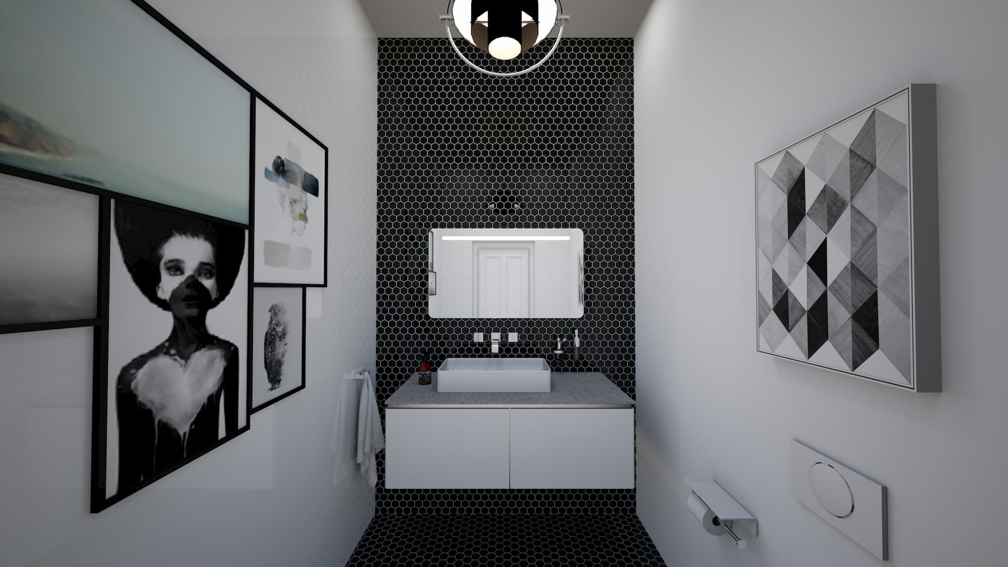
How to Create a Dramatic Black and White Room in Your Home
Bathrooms, guest WCs and kitchens are fantastic spaces in which to create a dramatic look, especially when an achromatic colour scheme is used. These spaces pack a punch without being in your face all of the time and therefore don't become too overwhelming. To create a dramatic bathroom such as the one in this image, apply the 60-30-10 rule as follows:
60% Dominant Colour - brilliant white
30% Secondary Colour - pure black
10% Accent Colour - cool greys and metallic silvers
Note: A more darker looking scheme which is just as dramatic, can be created by switching around the dominant and secondary colours.
INTERIOR DESIGN TIPS:
Maximum use of hard finishes, e.g. tiles and metallics, along with the minimal use of soft, textured fabrics will enhance the cool, crisp look of your room
Use contrasting colours for picture frames as they will add to the drama that you wish to create; adding a feature wall in the secondary colour will enhance this
Adding grey in varying gradients, including the use of metallics, in this case silver, will add a luxurious touch to your scheme, as well as create balance
Use cool white bulbs in your lighting to finish off the look!
WAYS TO CHANGE THE LOOK:
To soften this look without losing its essence:
Use textures in the form of fabrics and linen baskets containing soft luxurious towels in them to soften the space
Introduce plants, for example, white orchids, roses and lilies in gloss black vases, all are in keeping with the colour scheme and will add a subtle softness to it
How to Create a Soft, Airy Achromatic Living Room in Home

With its ample natural light and predominant use of light colours, this living room is bright and airy. It also has a soft, peaceful and serene vibe to it, thus making it the perfect space in which to relax and unwind. To recreate this soft, bright and airy interior in your home, apply the 60-30-10 rule as follows:
60% Dominant Colour - mixture of bright and soft whites, e.g. ivory, antique white, brilliant white
30% Secondary Colour - true greys, e.g. chic shadow, polished pebble
10% Accent Colour - black
Note: bright whites will help to reflect light around the room, whilst mixing them with soft whites will add warmth and prevent the overall scheme looking cold
INTERIOR DESIGN TIPS:
Add soft textured fabrics such as chenilles, velvets and wools for furnishings. This will enhance the softness of your room
Do not be afraid to incorporate pure black accents into your scheme, as without them, your room will look dull and incomplete
Mixing plain and patterned fabrics for your furnishings and wall art in contrasting colours will add an element of interest to your room
WAYS TO CHANGE THE LOOK:
To make this living room look more luxurious:
Replace the rustic wood tables with ones that are made of metallics, or a combination of metal with glass
Add a trio of gloss black and white vases in varying heights to the tables
Replace the wooden lantern with one that is made of metal and glass
POINTERS TO GET YOU STARTED…..
Search for achromatic coloured living spaces in Pinterest, home lifestyle magazines and on the internet
Create at least two inspirational mood boards from the images you have collated, so that you can compare the boards
Arrange your images based on how they work with each other; you will soon get a feel about what does and does not work together
Until you feel more courageous, use the 60-30-10 colour rule!