
Achromatic Colour Harmonies in Interior Design
What Does Achromatic Mean?
With its fancy name, one could be forgiven for having visions of Joseph and his Amazing Technicolour Dreamcoat! Sadly, if I sold this vision to my interior design clients, as a reference for an achromatic colour harmony, I’d be up the proverbial creek, sooner than I could blink!
As with many fancy long English words, we have the wonderful, drop-dead-gorgeous Greeks to thank for the origins of the word achromatic. Of course, we didn’t just go and steal it from the Greeks, instead, we went around the houses to do it! Achromatic comes directly from the French word ‘achromatique', which in turn comes from the Greek words ‘a-' and ‘khrōmatikos’, where ‘a-‘ means without and ‘khrōmatikos’ which comes from the word ‘khrōma’, means colour. Put simply, the word achromatic, means ‘without colour’.
An Achromatic Colour Scheme Is One Without Colour…..
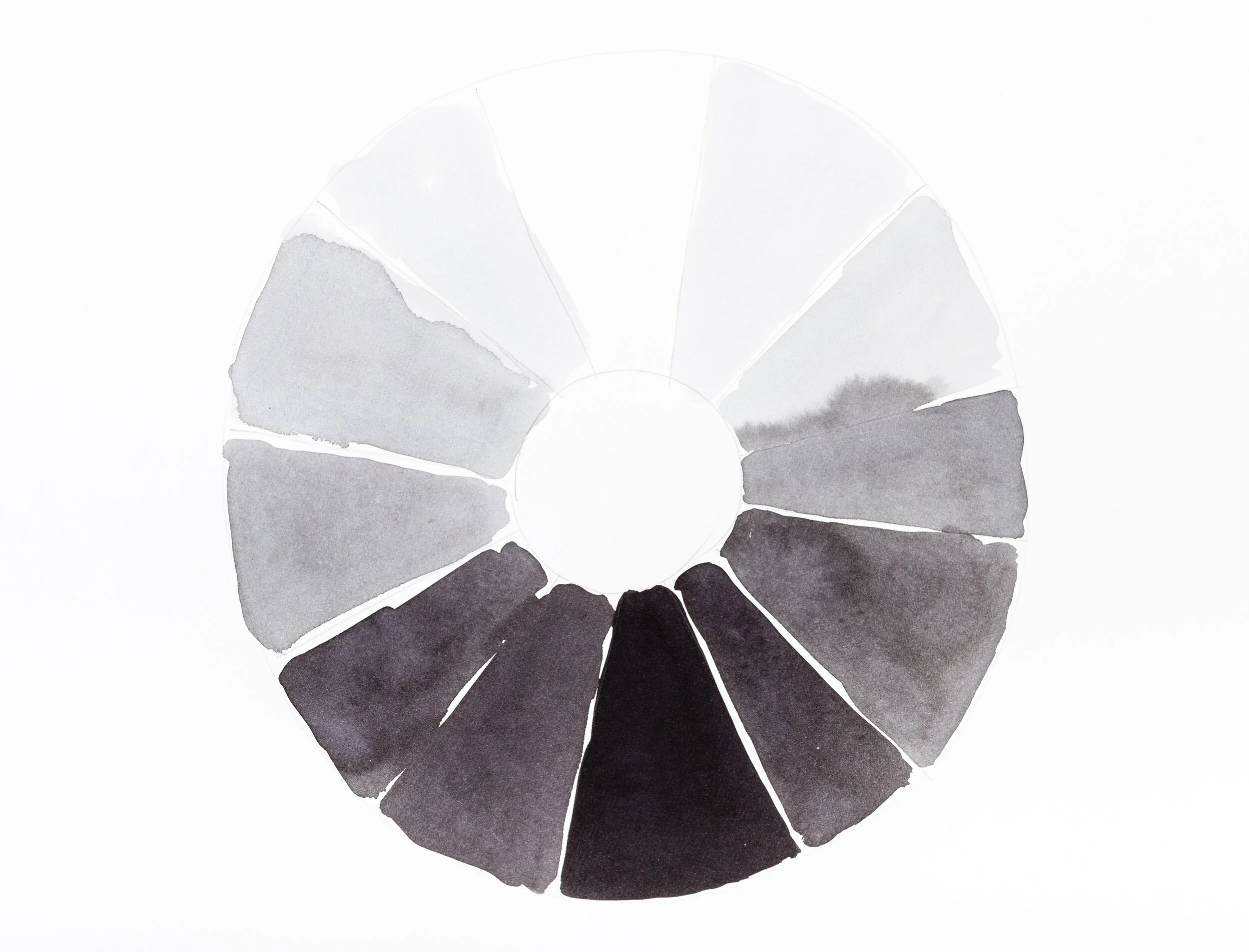
There is colour everywhere in interior design, so how can we select a colour harmony for our home interiors, which is without colour? Does this even make sense? To understand this, we have to turn to the scientific definition of the word achromatic, where an achromatic colour is defined as being one that lacks hues. In laymen’s terms, colours which lack hues are whites, greys and blacks. These colours have lightness, but have no hue or saturation, which is why they are not found on a colour wheel. Therefore, put simply, an achromatic colour scheme is one which contains only whites, greys and blacks.
Creating Achromatic Colour Schemes in Interior Design
Despite only having two colours at its core, i.e. black and white, an achromatic colour harmony is extremely versatile and appeals to both men and women. By manipulating the tints, shades and tones of the base colours, the colour combinations are endless, and the finished look will either be cool and crisp, or soft and warm. And whilst the use of the colour black might feel daunting to some, when used effectively, the end results can be absolutely stunning.
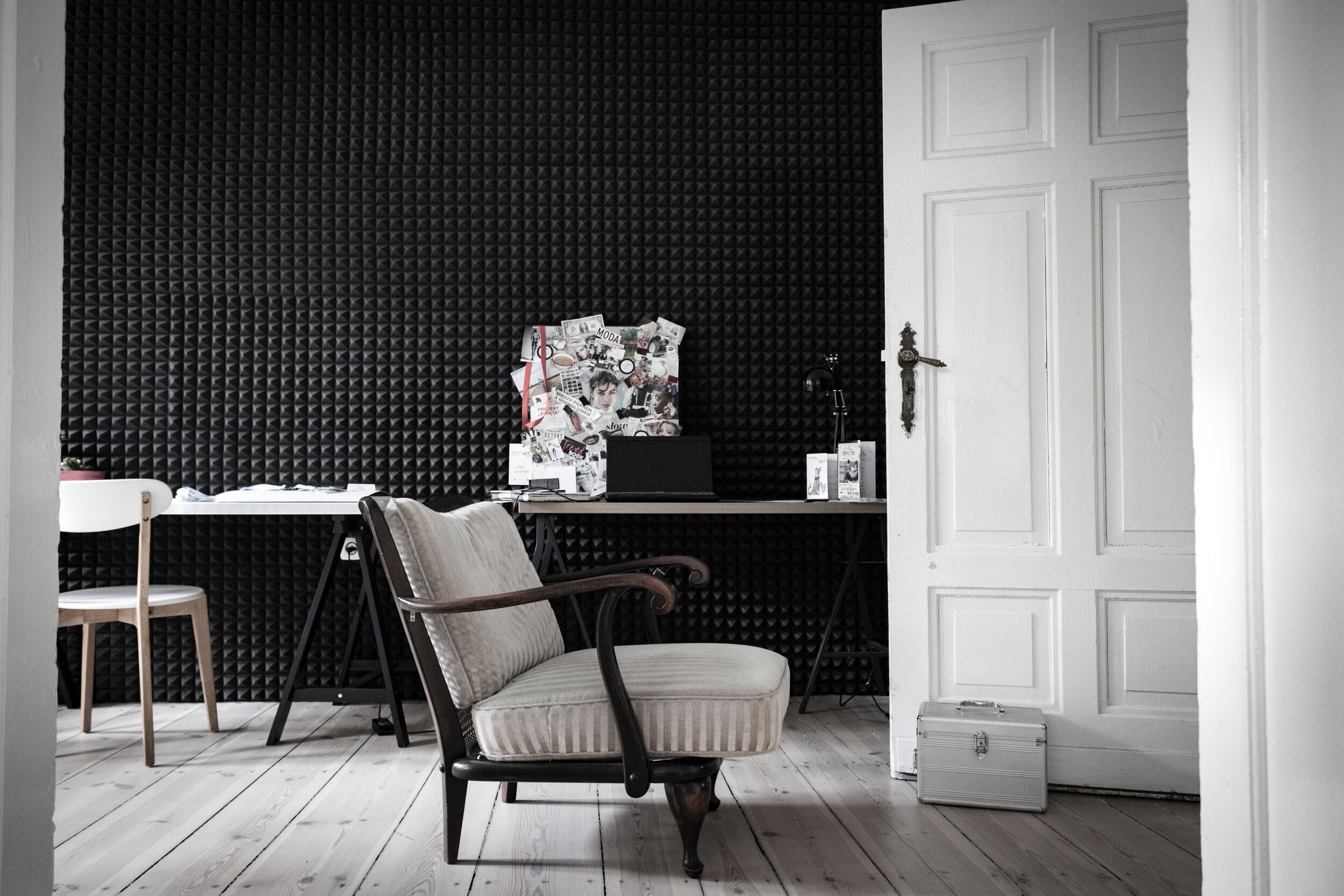
The versatility of an achromatic colour harmony is such that it can be used in any room of the house, and in rooms of any size. It is not uncommon therefore to see achromatic colour schemes in small bathrooms, massive kitchens, and tiny hallways. One example of the latter being old victorian hallways with their intricately patterned black and white tiled floors.
In small rooms, to create an illusion of space, we would use white, or shades of white, as the dominant colour and then use the darker colours as accents. By doing this, the room will look and feel bright and airy. Again, this is frequently seen in bathrooms, where unless you live in a mansion, the spaces are inherently small and therefore lend themselves well to an achromatic colour scheme.
In larger rooms, a cosier feel can be created by applying the theory in reverse. Darker shades of greys and black would be used as the dominant colours, whilst the lighter colours would be used to balance the overall look. By taking this a step further and painting the doors and joinery, as well as the ceiling in the same dark colour as the walls, it doesn’t have to be jet black, the cosy space would turn into something much more dramatic. Think Abigail Ahern!
Achromatic colour schemes also have the versatility to be used with different design styles. For example, one client may want an ultra-modern interior which is bright and airy and flooded with light using this colour scheme. Another client may want a gothic inspired interior using an achromatic colour scheme which is dark, dramatic and multi-sensory. Another may want an art deco inspired interior, with a more balanced use of whites and blacks.
The achromatic colour harmony is one which I absolutely love, and much to my mother’s dismay, it is one I have used in my house when I was living in Bahrain. Whilst my use of the achromatic colour scheme resulted in an overall look which was very light, bright and airy, the fact that there was the colour black in my house was enough to make my mother shriek! You see, in my culture, and in particular, in my family, we are not allowed to wear the colour black. So, to have it in my home was equally bad. Please don’t ask me to explain the why’s and wherefores of this unwritten family rule, I haven’t a clue where to begin……I just silently nod my head in submission! What I do know is that my poor grandfather is probably still turning in his grave, as I had my luxurious black velvet bed shipped back from Bahrain! Well, I wasn’t going to leave it behind!
Despite the family rule, I will no doubt, continue to use achromatic colour schemes in my home, even if on a more subtler scale. I am also delighted to report that my mother is slowly coming on board!!! I mean, how could anyone turn their nose up at a polished pure white Thassos marble floor with detailed borders in jet black?! Seriously though, I would urge everyone, even the most sceptical person, to give the achromatic colour harmony a go. The possibilities really are endless, and there is a colour scheme within this colour harmony to suit everyone’s taste.
Here are 3 Examples of Achromatic Colour Schemes
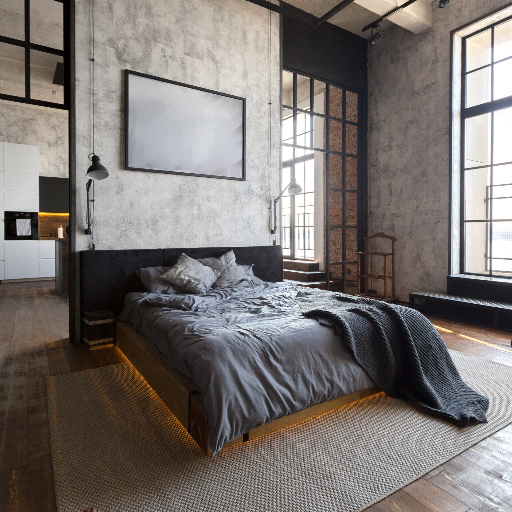
Warm Achromatic Colour Scheme
A warm achromatic colour scheme is perfect for spaces of this size, especially given the large floor to ceiling industrial windows. The light flooding through the windows will naturally balance out the use of dark colours, thus avoiding any risk of the dark colours becoming too heavy.

Cool Achromatic Colour Scheme
In a small room such as a guest WC, an achromatic colour scheme can add drama with the use of black for the feature wall and floor, whilst maintaining balance with the dominant use of white.
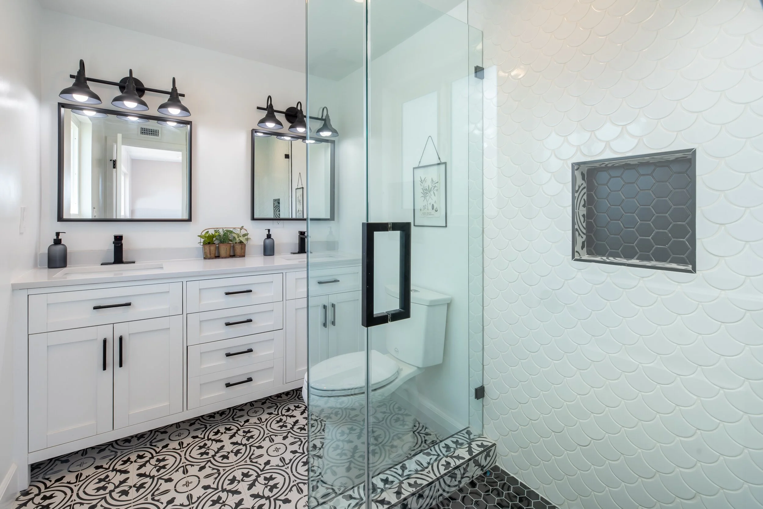
Bright Achromatic Colour Scheme
In contrast to the cool achromatic guest wc image above, here is an example of a cool achromatic colour scheme with a much brighter overall look. The dominant use of whites on all walls, and the large mirrors help reflect light around the room. Accents of blacks and greys add contrast to the room without overwhelming or competing with the white.