How Colour Harmonies Are Used in Interior Design
Colour Theory
Behind all colour combinations in the design world, be it an interior design scheme, an artist’s painting, a graphic designer’s work, or in the composition of photographs, is the theory of colour. Colour theory can be defined as a structured framework, or a bible if you like, of the art world dictating the specific selection of colours, enabling artists and designers alike, to effectively convey their clients’ requirements into a visually harmonious and aesthetically pleasing form.
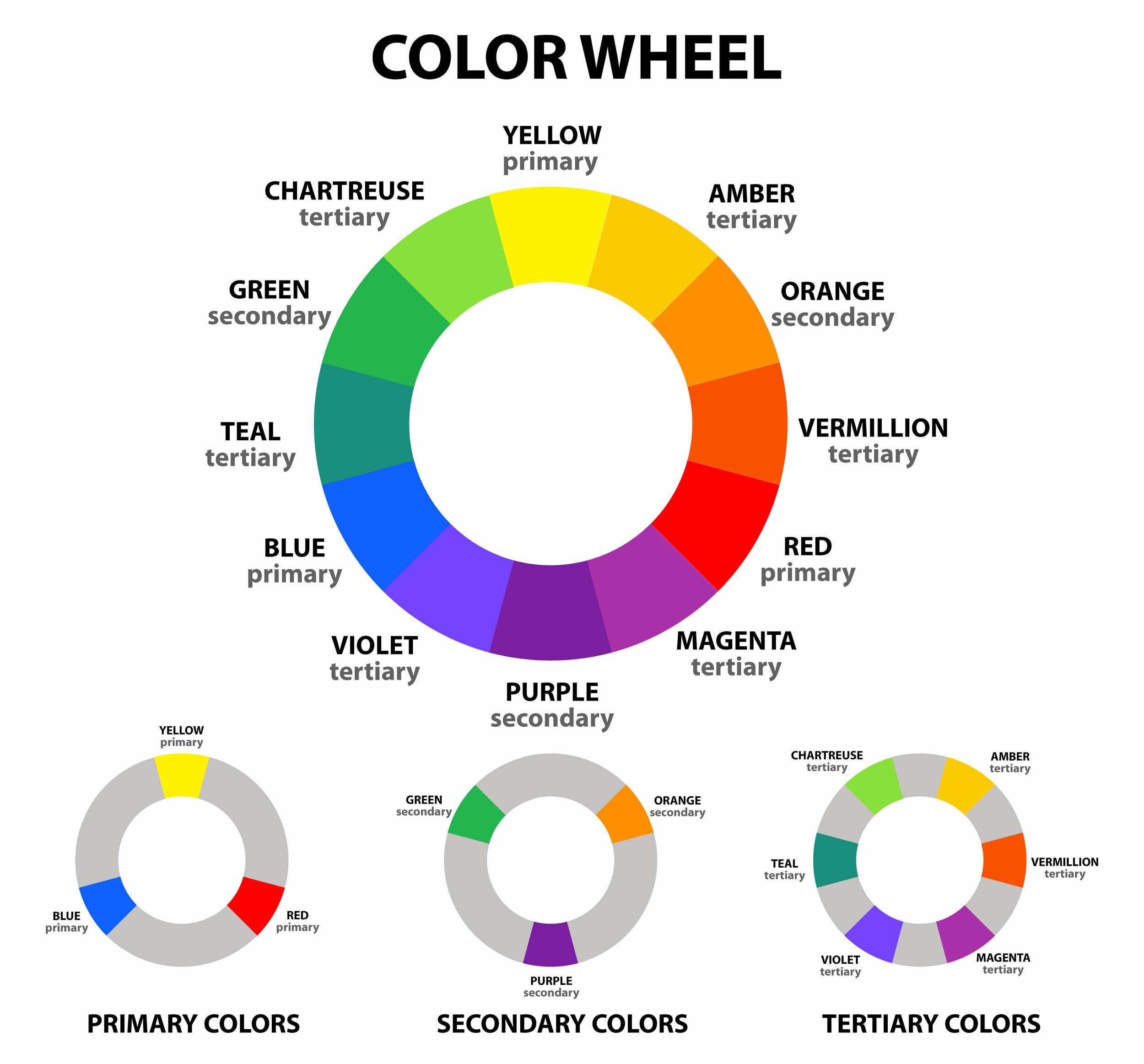
To fully understand colour theory and the formation of colour harmonies, one must first understand the composition of a colour wheel. Consisting of twelve pure colours, the colour wheel comprises of three primary colours, three secondary colours and six tertiary colours.
Primary Colours
Red | Yellow | Blue
Primary colours, of which there are three, are defined as pure hues that cannot be created from blending together other colours. Equidistant from each other on the colour wheel, primary colours each have three colours sitting between them.
Secondary Colours
Orange | Green | Violet
When any two primary colours are combined, the three resultant colours are called secondary colours. Positioned halfway between their primary colours on the colour wheel, secondary colours each have two tertiary colours situated either side of them.
Tertiary Colours
Red-Orange | Yellow-Orange | Yellow-Green | Blue-Green | Blue-Violet | Red-Violet
Similarly to secondary colours, tertiary colours are formed by blending a primary colour with a secondary colour. There are six tertiary colours in total, situated either side of the secondary colours.
Colour Terminology and Definitions: Hues, Tints, Shades & Tones
Whilst the colour wheel consists of twelve pure colours, it goes without saying that there are many examples of colour beyond these twelve that are found in everyday life. The reason behind this, is that each colour has varying combinations of hues, tints, shades and tones which will affect the final outcome of that colour. In doing so, designers are able to create bespoke colour schemes to suit their clients’ specific requirements.
What is a Colour Hue?
A hue, also referred to as a pure hue, is the truest form of a colour, i.e. a pure pigment whereby its colour has not been distorted by any additions of the colours white and/or black. All twelve colours that form the foundations of the colour wheel, are classed as pure hues.
What is a Colour Tint?
Where the colour white is added to a pure hue, the resultant colour is lighter than the original hue. This is referred to as a tint. The greater the addition of white, the lighter the tint will be. Lulworth Blue from Farrow and Ball is an example of a sky blue tint, derived from the pure blue hue.
What is a Colour Shade?
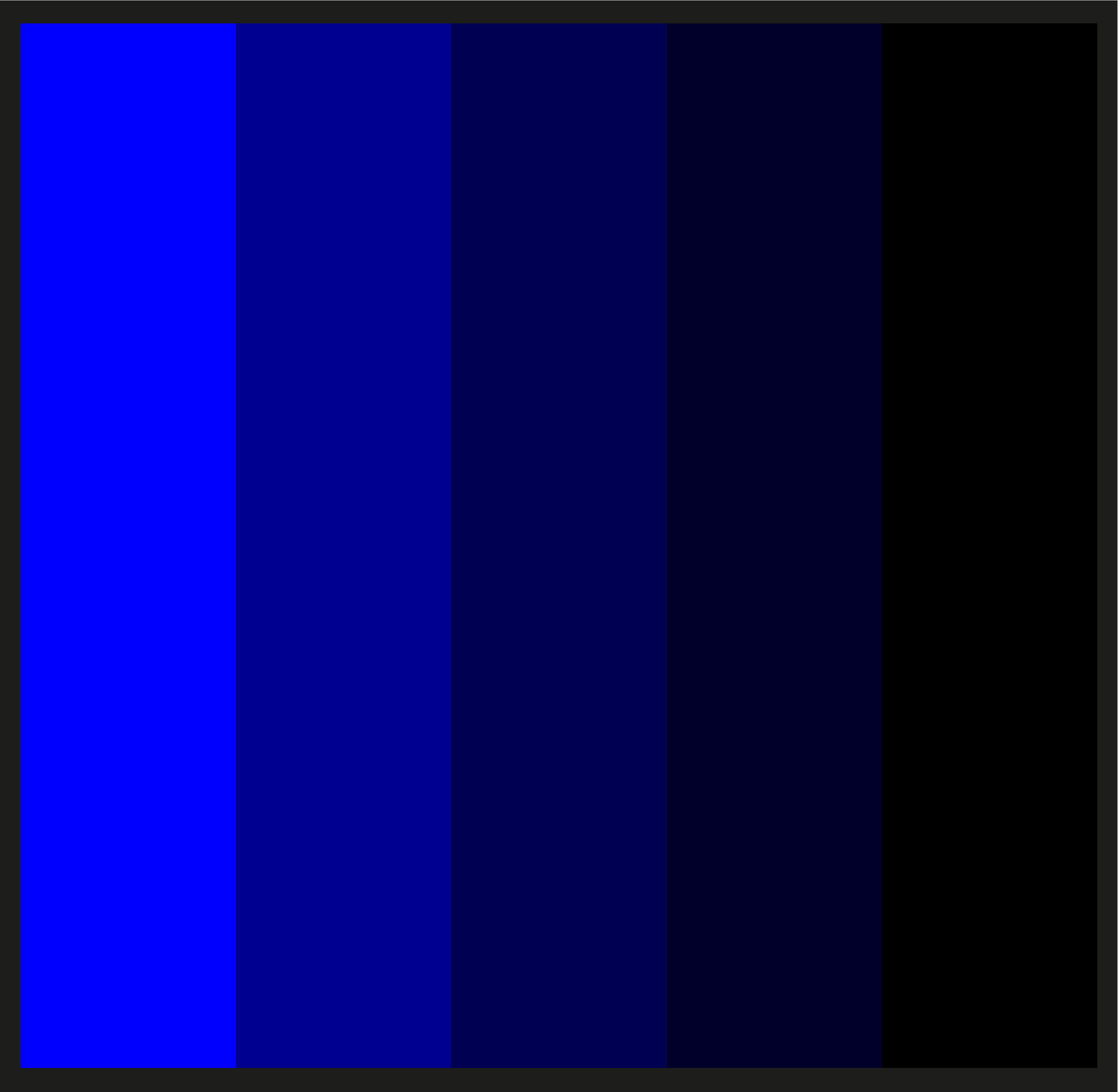
Although the use of the word shade is widespread, in colour theory a shade refers to the resultant colour produced when black is added to its hue. Thus, a shade is always darker than its hue. Multiple shades are created with varying amounts of black. Navy is an example of a shade.
What is a Colour Tone?
When varying amounts of black and white, i.e. grey, are added to a pure hue, the resultant colours produced are termed tones. Adding grey to a hue will always have a dulling affect on its brilliance. Great examples of a tone, are Grey Stone and James by Little Greene Paints.
How Colour Harmonies Are Used to Create Interior Design Colour Schemes
What is a Colour Harmony?
Alongside interior designers, colour harmonies are used throughout the creative world, by artists, graphic designers and photographers alike, but what exactly is a colour harmony? The specific use of colours in combination with each other in order to create aesthetically pleasing colour schemes, are referred to as colour harmonies. The combinations of colours selected and their position on the colour wheel are determined by the specific colour harmony being used for a project. When implemented correctly, the colour schemes created will either be harmonious or contrasting, but always cohesive.
How Do Interior Designers Use Colour Harmonies When Designing Interiors?
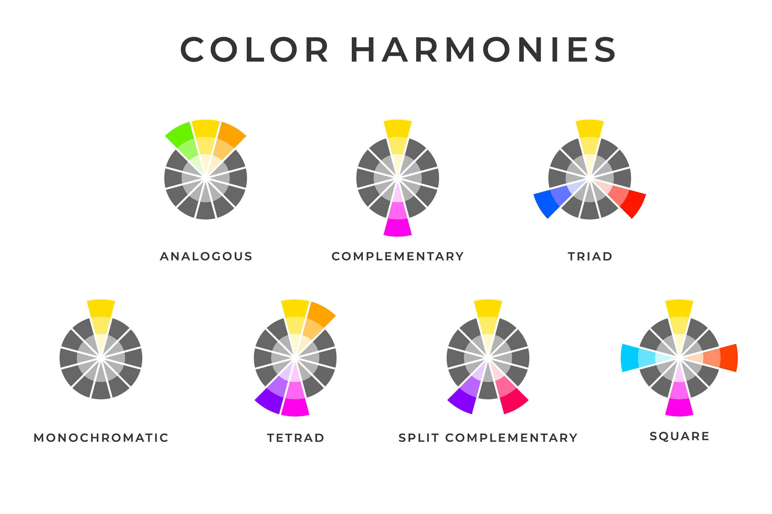
Interior designers use the theory of colour harmonies to create colour schemes for their clients’ projects. Typically, interior designers will use one of eight colour harmonies from which to create their colour scheme. In the colour harmonies chart below, seven of these eight colour harmonies are shown. The eighth colour harmony, i.e. an achromatic colour harmony, is not shown and the reasons for this are explained below.
Achromatic Colour Harmony
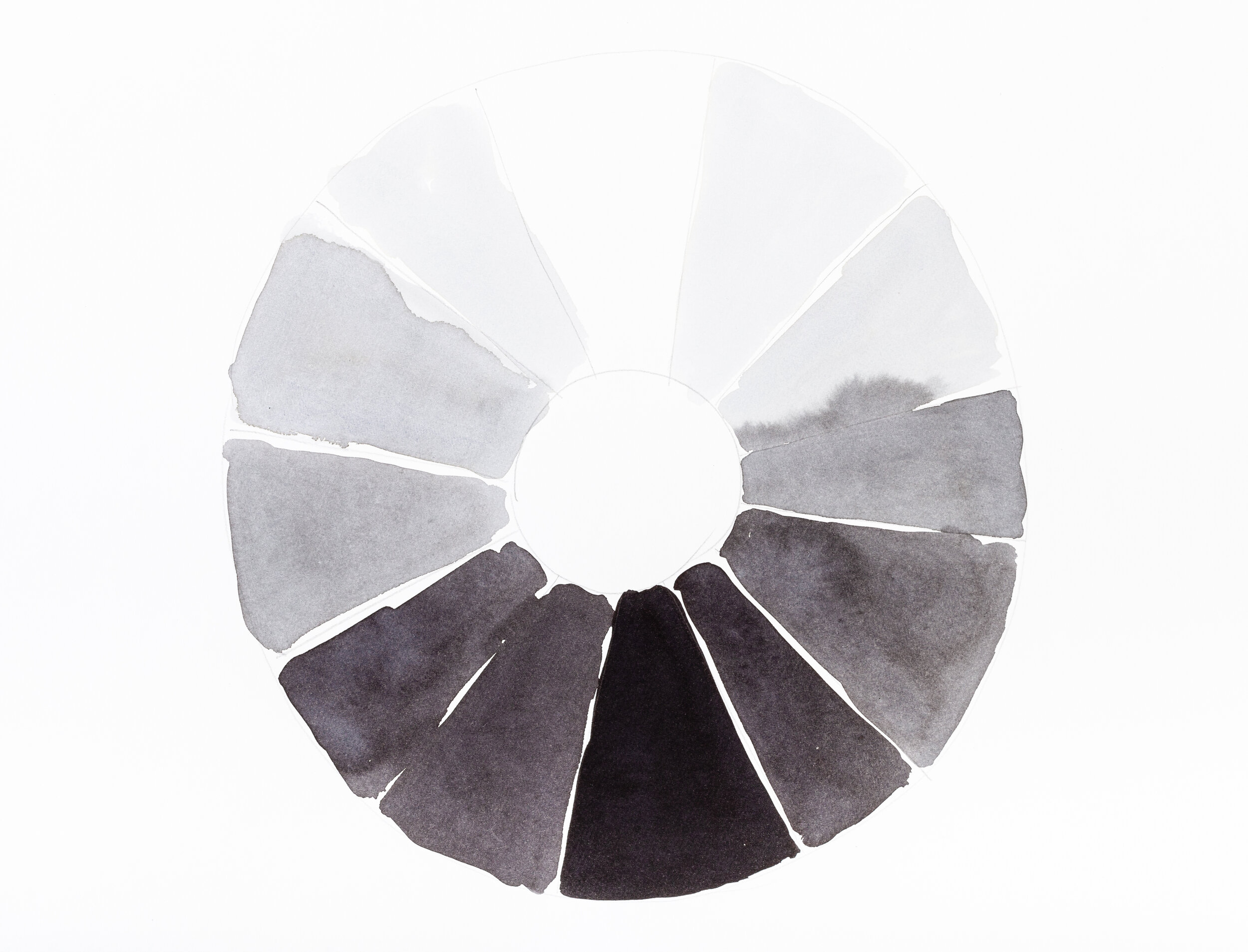
By definition, achromatic colours are devoid of hues and saturation and this is the reason why they are not found on the colour wheel. In layman’s terms, achromatic colours refer to the colours black and white, plus all combinations of grey in-between. Oftentimes, achromatic colour harmonies are incorrectly termed monochromatic colour harmonies, despite the latter having a much broader definition.
Monochromatic Colour Harmony
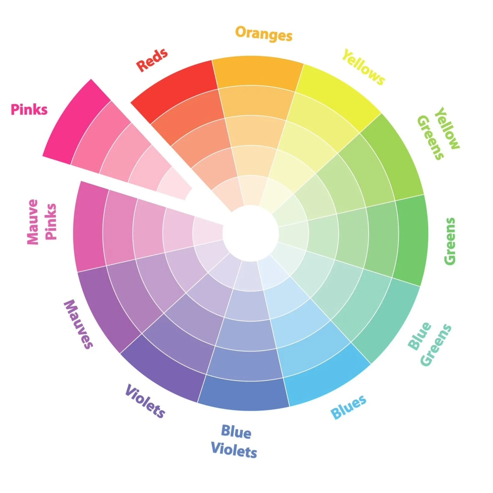
Monochromatic colour schemes are created using varying gradients of a single colour hue. For example, in this monochromatic colour wheel, the pink segment has been segregated from which varying colour schemes can be created by using differing combinations of pink. Visually, monochromatic colour schemes are incredibly harmonious and evoke feelings of peace, calm and serenity.
Analogous Colour Harmony
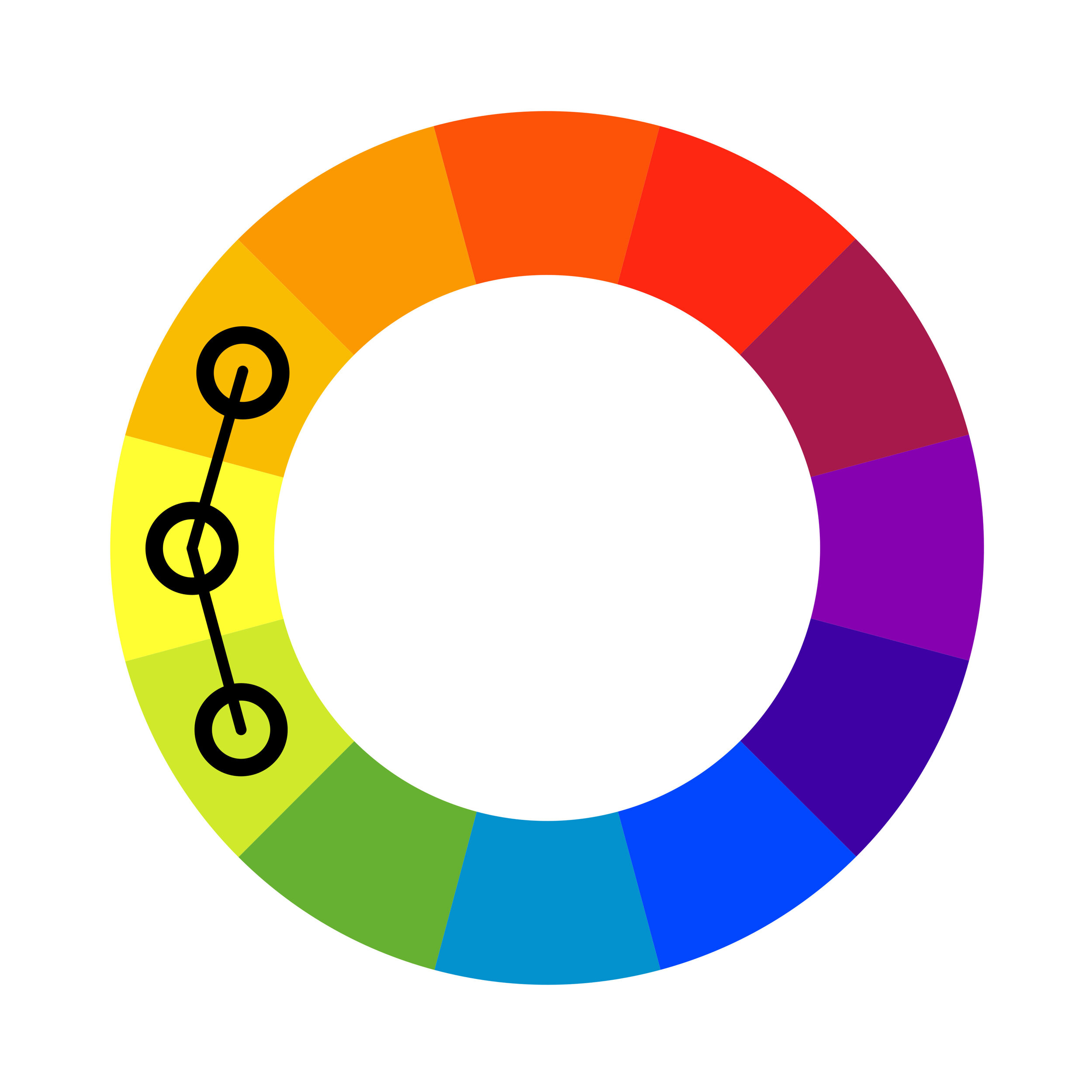
The combination of any three colours that sit alongside each other on the colour wheel is known as an analogous colour harmony. Given the order in which primary, secondary and tertiary colours sit alongside each other, analogous colour schemes will always have one colour that is a blend of one of its counterparts. Like monochromatic colour schemes, analogous colour schemes are harmonious in nature.
Complementary Colour Harmony
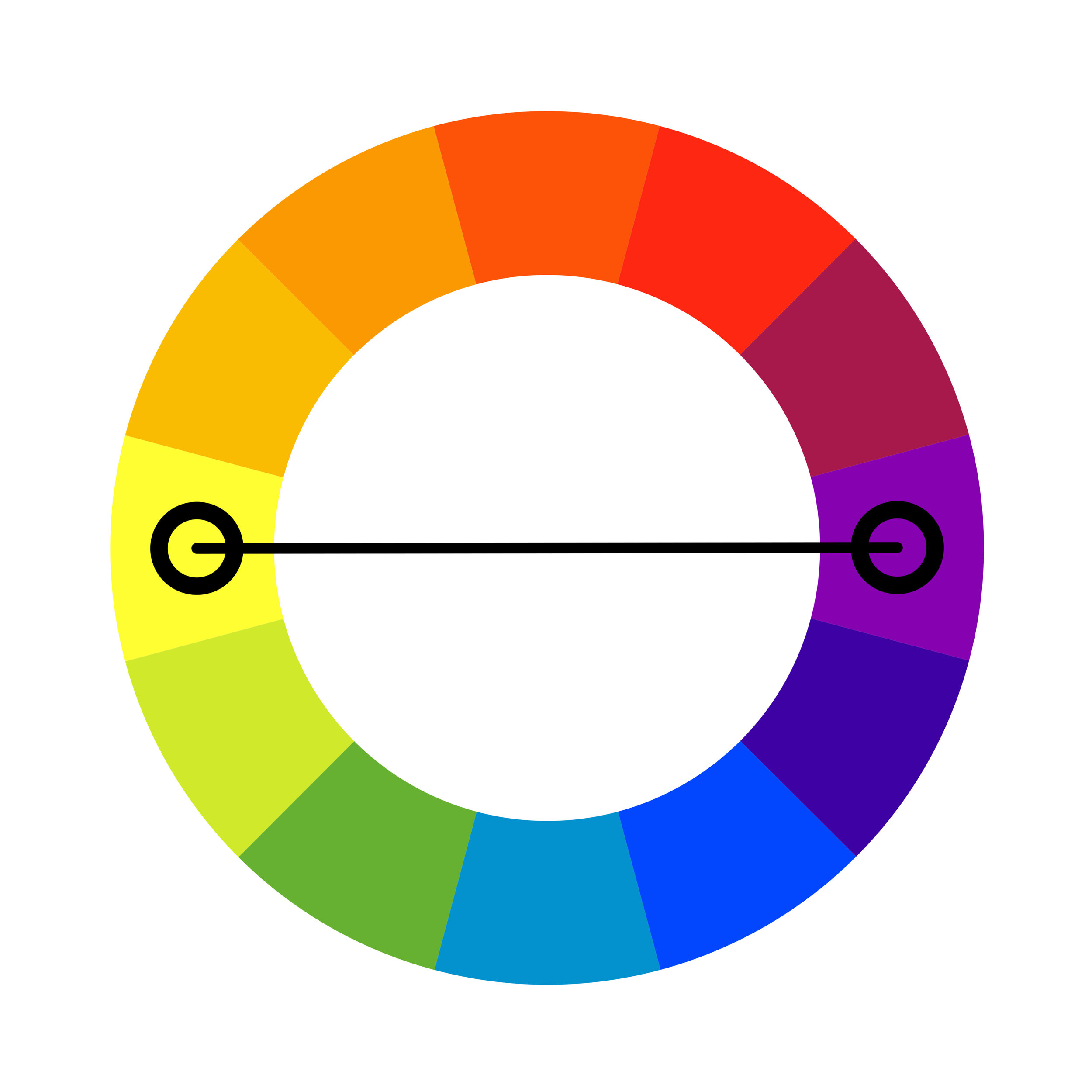
Complementary colour harmonies are created using two colours directly opposite each other on the colour wheel and will comprise only of primary, secondary or tertiary colours, but never a combination. By their very nature, opposing colours are highly contrasting and when used in full saturation, complimentary colour schemes can create extremely vibrant and impactful interiors.
Split Complementary Colour Harmony
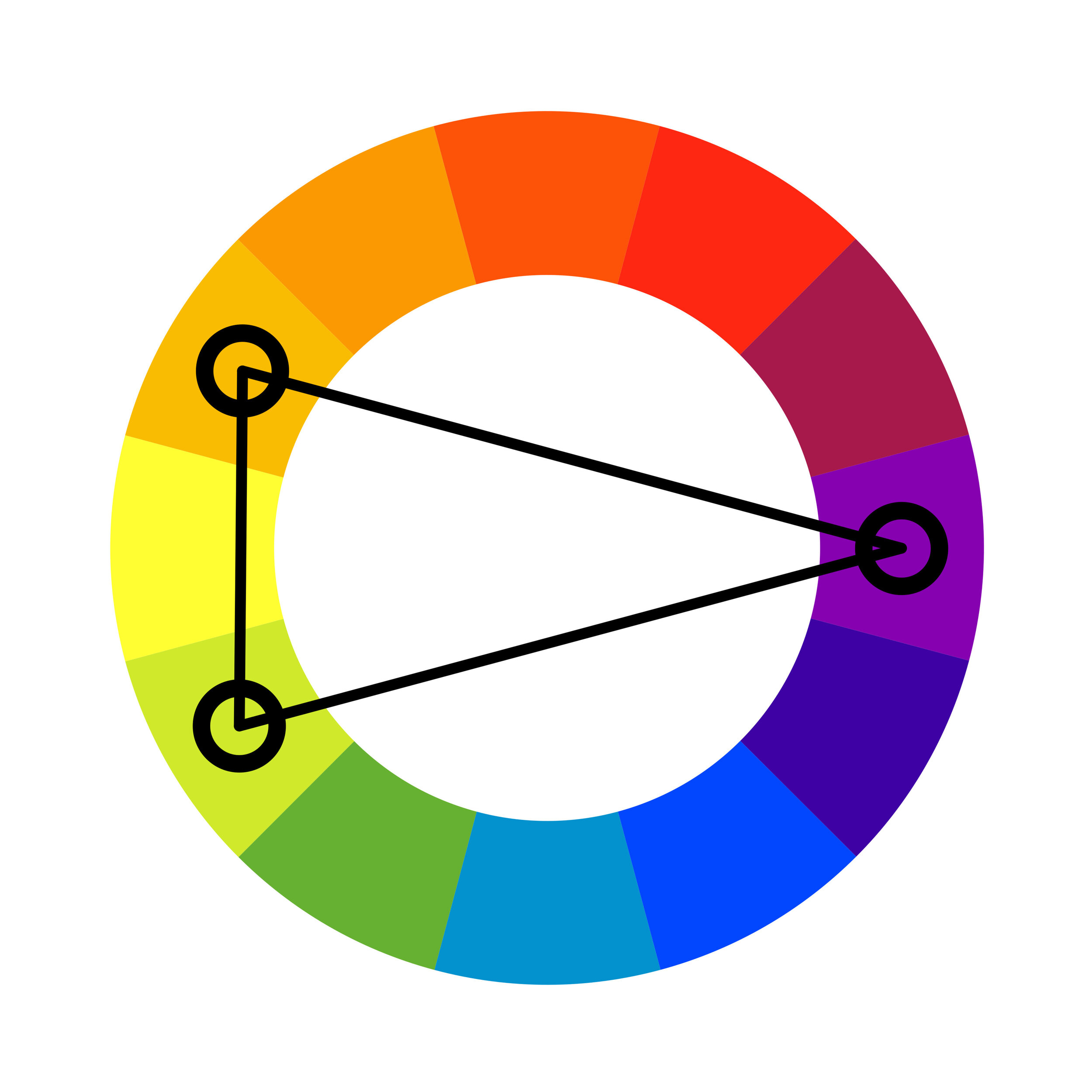
Made up of three colours, split complementary colour harmonies are a variant of complementary colour harmonies. By selecting one colour and adding the two colours sitting on either side of its complement, a split complementary colour scheme is created. The resultant colour schemes are more varied and tend not to be as bold or jarring as those in complementary colour schemes.
Triadic Colour Harmony
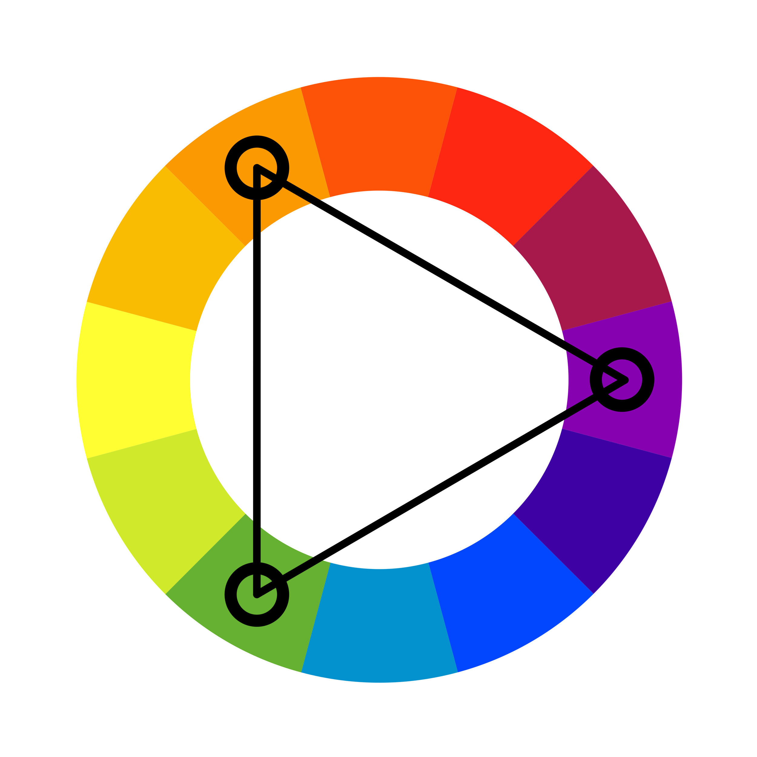
Triadic colour harmonies are created using three colours equidistant from each other on the colour wheel. Notwithstanding the colour combinations selected, there will always be three colours between each selection. As a result, triadic colour harmonies comprise only of primary, secondary and tertiary colours, never a combination. They are highly contrasting, vibrant colour schemes which are often seen in playgrounds.
Tetradic Colour Harmony
A tetradic colour harmony, also known as a rectangular or double complementary colour harmony, is a four colour harmony created using two pairs of complementary colours. Depending on the colours selected, a tetradic colour scheme will always comprise of either two primary colours plus two secondary colours, or, four tertiary colours. As a result, tetradic colour schemes can be quite complex and difficult to master.
Square Colour Harmony
A square colour harmony is similar to a tetradic colour harmony, such that it comprises of two pairs of complementary colours and will have four colours in any given scheme. Its name comes directly from the fact that the selected four colours form a square on the colour wheel. Unlike the tetradic colour harmony, a square colour harmony will always contain one primary colour, one secondary colour and two tertiary colours.
The Importance of Understanding Colour Harmonies When Creating Interior Design Schemes
It is imperative when embarking on an interior design scheme, be it as a designer, or as a client, that the basic theory of colour and colour harmonies is understood. Without this basic understanding, we run the risk of creating interior design colour schemes with colours that simply do not work together. When this happens, no matter how much money has been injected into a project, or how stunning the furniture, lighting and accessories selections are in isolation, together, they will clash. These clashes aren't always glaringly obvious, they can be extremely subtle, but the end result is that “something doesn’t look right” and when this happens, that’s when the disappointment kicks in. It is therefore, crucial to spend the time and effort into laying down the foundations before charging head with your design scheme. When the foundations are right, achieving the desired outcome becomes much easier.


